Sirius Design System
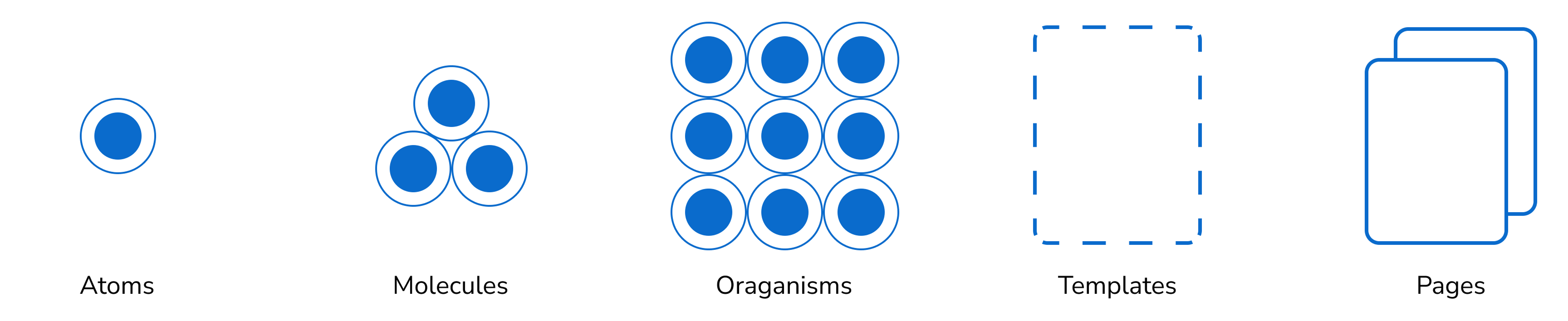
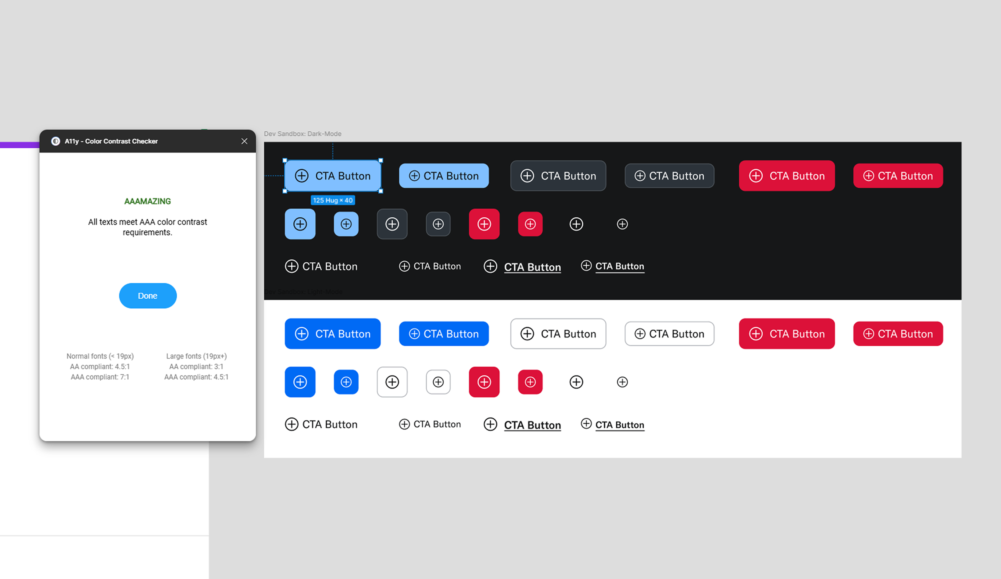
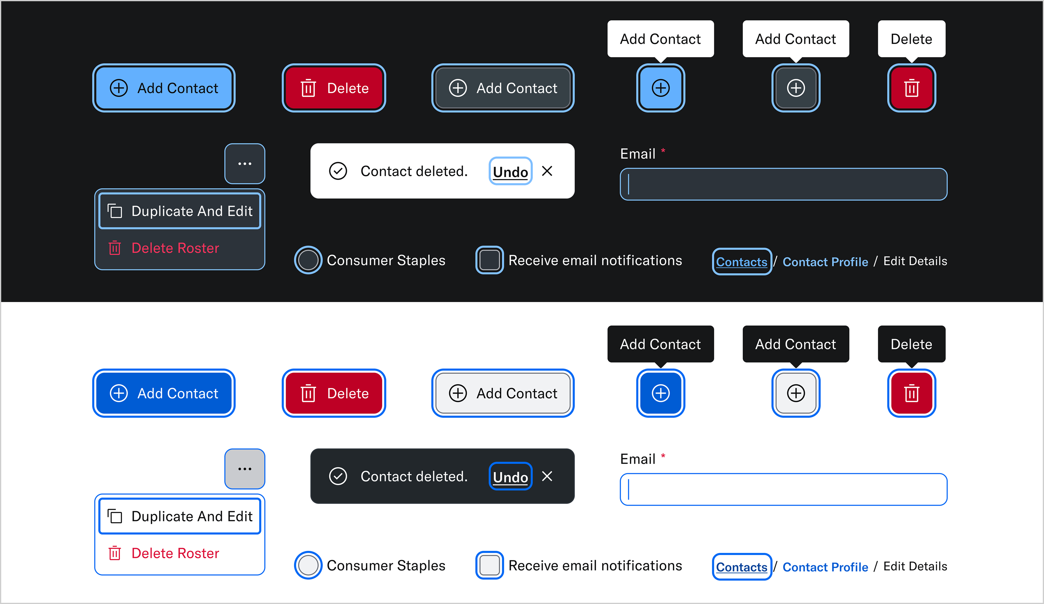
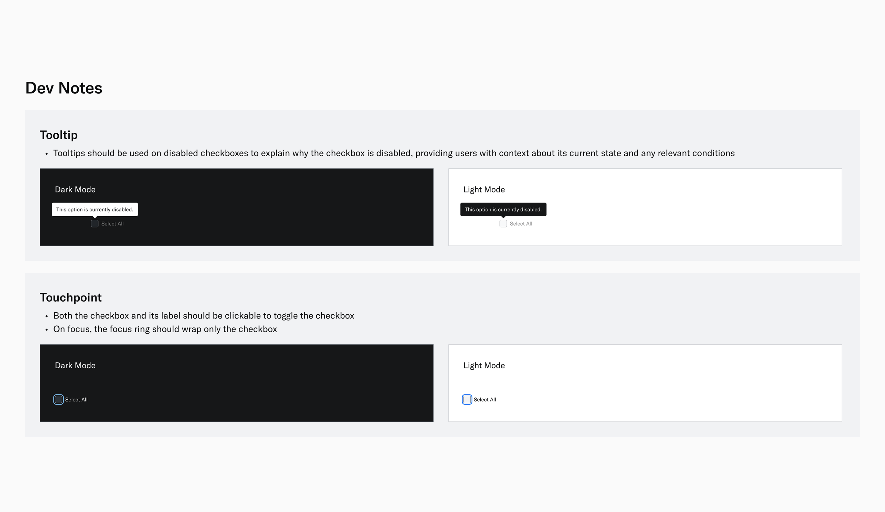
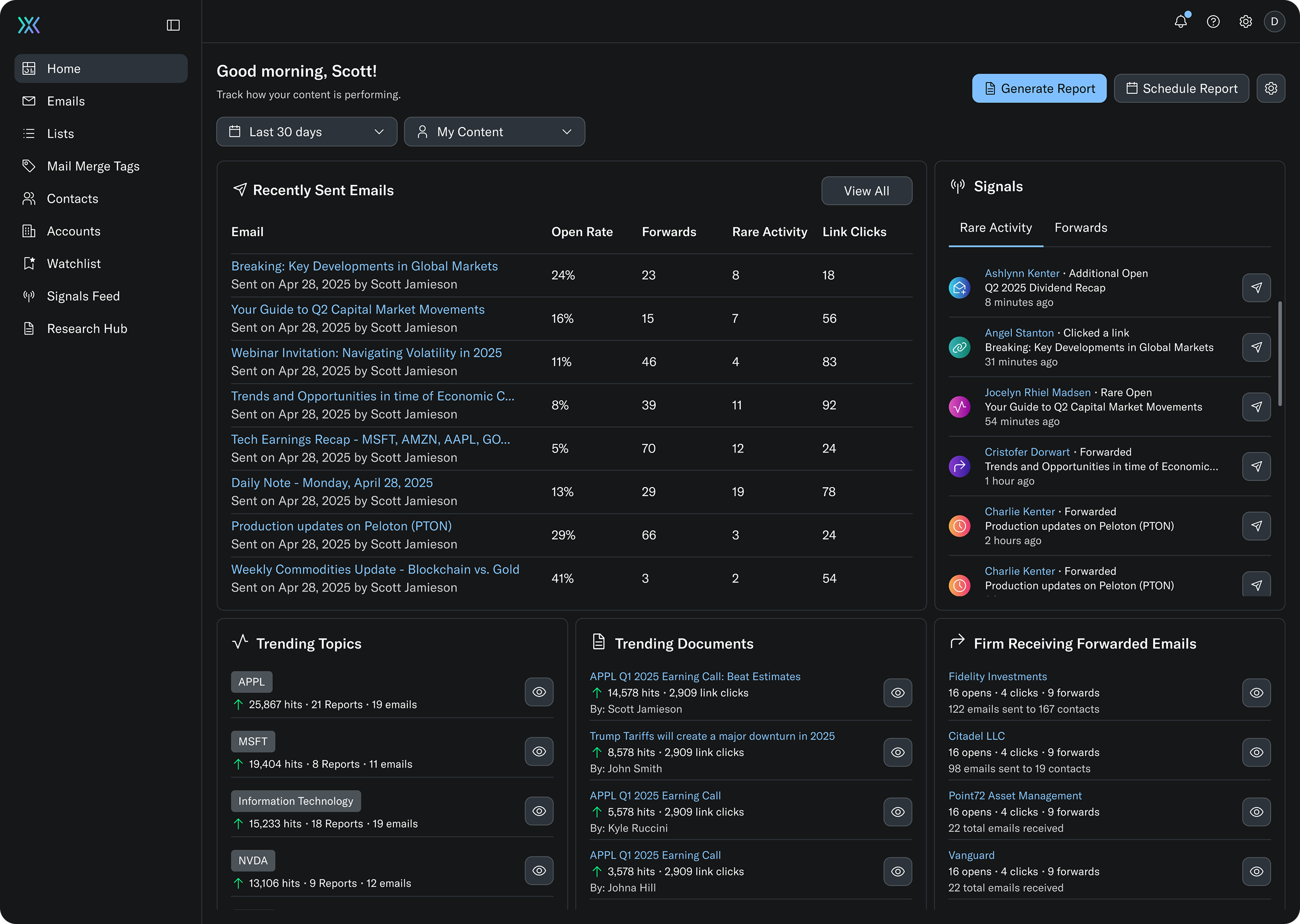
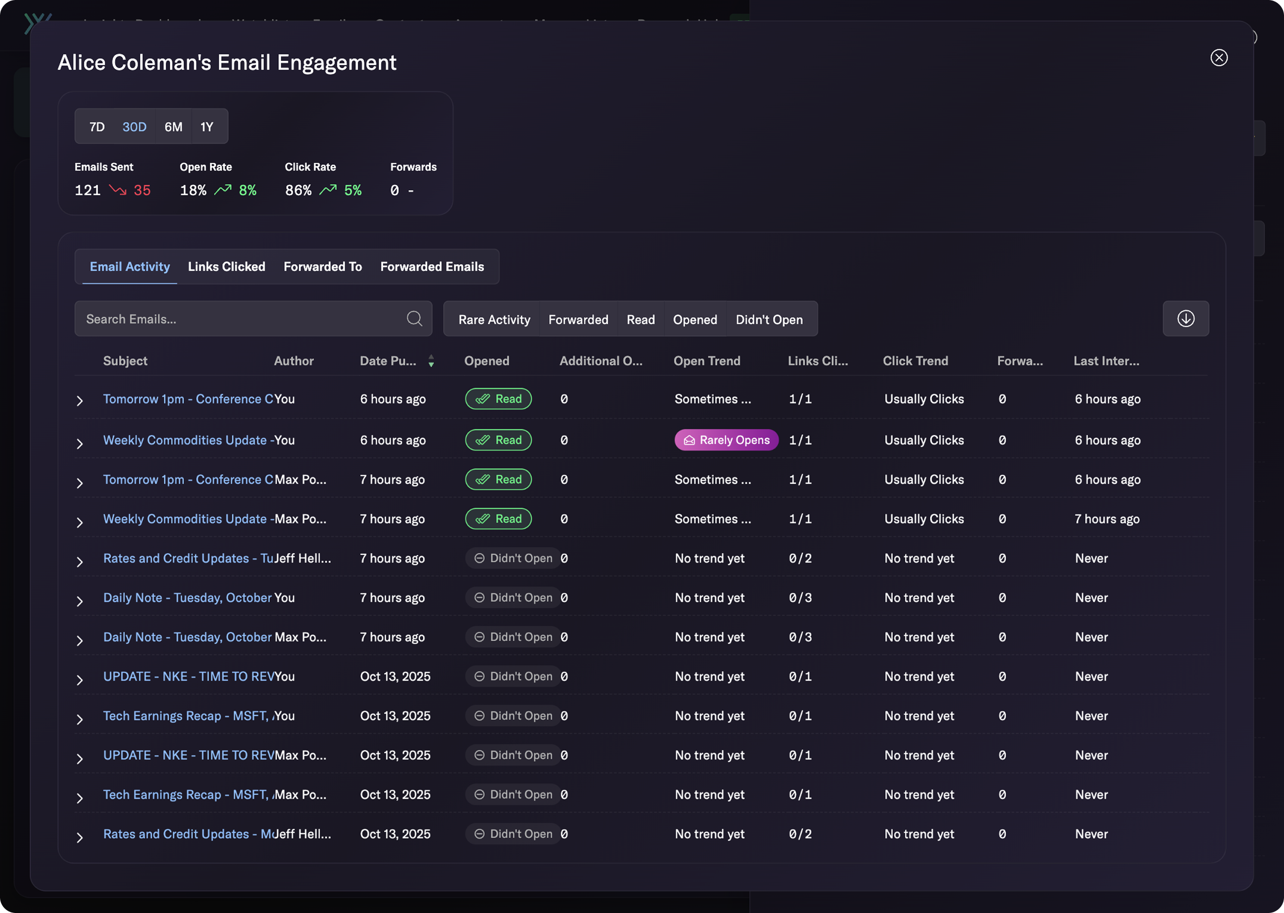
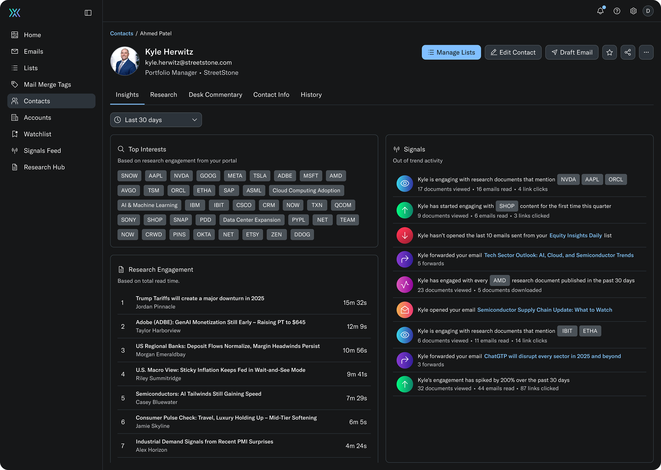
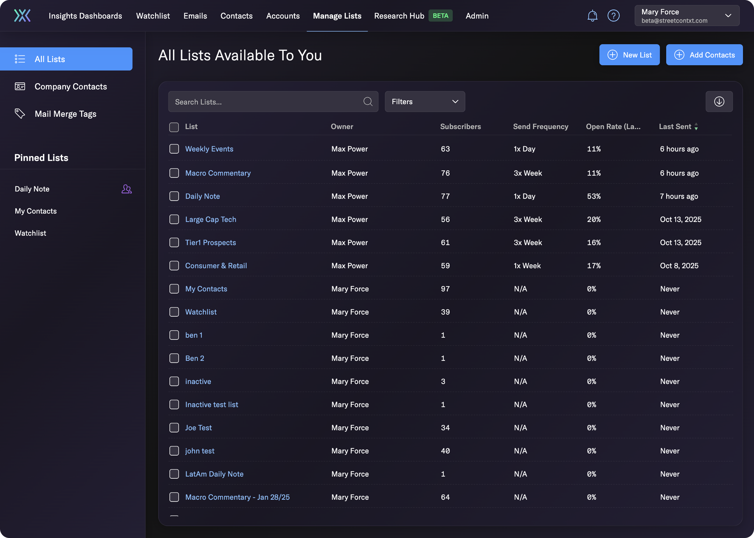
📝 I built a scalable design system from scratch in Figma and partnered with engineering to implement it in Storybook.
❌ The existing design system had no documentation, was WCAG 2.0 noncompliant, and had performance issues.
💡 This was an opportunity to create a WCAG 2.0 compliant, performance-first design system that drives enterprise revenue.
Constraints
- Ensure minimal visual disruption to preserve user familiarity.
- Must pass WCAG 2.0 accessibility requirements.
- Ensuring consistency across light and dark modes.
Timeline & Methods
- July to January (6 months).
- Accessibility audits (WCAG 2.0), atomic design, Figma component design & prototyping, and design system documentation.
Role & Scope
- Owned the end-to-end design system, partnering with product and engineering to implement components in Storybook.
- Weekly update sessions with the Lead Product Designer.
Strategy and Approach
Selected Framework
Atomic design provided a scalable framework for consistency and accessibility, breaking the UI into reusable building blocks that sped up development, reduced visual inconsistencies, and ensured WCAG 2.0 compliance across the platform.
Please click to expand the image.
Ensuring WCAG 2.0 AA Adherence
✅ Colour Contrast
- Color accessibility was validated at the component level using accessibility tools as designs were created.
Please click to expand the image.
✅ Keyboard & Screen Reader Support
- Every interactive component was designed with clear, visible focus states and predictable interaction patterns.
Please click to expand the image.
✅ Accessibility Documentation
- Component-specific accessibility requirements were clearly documented to guide developers.
Please click to expand the image.
From Atoms to Organisms
Design System Highlights
Below is a curated selection of atoms, molecules, and organisms highlighting the depth and scalability of the design system; these examples represent a subset of the components built.
🌰 Atoms
- Cut the color palette from 126 to 41 tokens while ensuring WCAG 2.0 AA compliant contrast in light and dark modes.
Please click to expand the image.
🌱 Molecules
- Fully documented Select component with anatomy, variants, and developer notes to standardize usage and eliminate guesswork.
Please click to expand the image.
🌸 Organisms
- Redesigned data tables with pagination and horizontal scroll, boosting performance and usability for large, research-heavy datasets.
Please click to expand the image.
Before and After
Homepage
🔧 Before
Please click to expand the image.
⭐ After
Please click to expand the image.
Contact Profile Page
🔧 Before
Please click to expand the image.
⭐ After
Please click to expand the image.
Lists Page
🔧 Before
Please click to expand the image.
⭐ After
Please click to expand the image.
Implementation Process
Collaboration with Engineering
- Adopted a headless Adobe React library for faster builds and flexible design.
- Refined component documentation with developers to catch technical blind spots.
Collaboration with Product Management
- Balanced ongoing feature work while rolling out the system over six months.
- Sprinkled design system tickets across sprints to avoid disrupting releases.
Enterprise Demos
- Created mockups using new Figma components for stakeholder and customer reviews.
- Gathered early feedback while demonstrating system scalability and accessibility.
Impact and Outcomes
💰 Revenue Unlocked
$700K ARR unlocked by onboarding two banks thanks to a WCAG 2.0 compliant design system.
✅ WCAG 2.0 AA Compliant
Platform fully WCAG 2.0 AA compliant, meeting enterprise accessibility requirements.
⏩ Time Saved
Hours to days saved for designers and developers through reusable, standardized components.
Next project

Litespace

An HR software that aims to connect employees in hybrid work models.